Remaking Apple Health's Sleep Graph in Vega-Lite
Tags: data
Apple Health has a very intuitive visualization of your nap time:

I wanted to rebuild this visualization in Vega-Lite. There were a lot of little snags I encountered doing so, so I decided to write them down so I don’t forget them. But first, let’s see my reproduction!
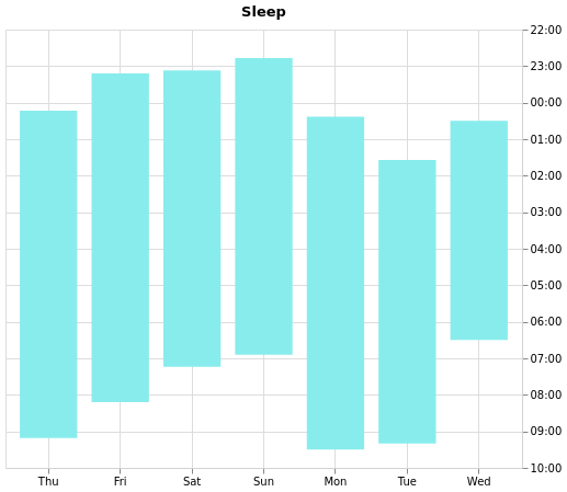
It is not pixel-perfect, but I’m pretty happy with how it turned out. If you have Javascript enabled, you can also try out the tooltips.
Anyway, let’s see how it’s made. First, some boilerplate:
{
  "$schema": "https://vega.github.io/schema/vega-lite/v5.json",
  "width": "container",
  "height": 400,
  "description": "sleep over time",
  "title": "Sleep",
Next, we’ll load in some sample data I made up. The field names should be self-explanatory:
  "data": {
    "values": [
      {"date": "2022-03-24", "start": "00:13", "end": "09:11"},
      {"date": "2022-03-25", "start": "23:12", "end": "08:12"},
      {"date": "2022-03-26", "start": "23:07", "end": "07:14"},
      {"date": "2022-03-27", "start": "22:47", "end": "06:54"},
      {"date": "2022-03-28", "start": "00:23", "end": "09:30"},
      {"date": "2022-03-29", "start": "01:34", "end": "09:20"},
      {"date": "2022-03-30", "start": "00:30", "end": "06:30"}
    ]
  },
Note that this sample data is a little weird. In particular, it’s not
clear which "date" that the "start" column corresponds to. For
example, the start time for the first row is 00:13 which probably
means 2022-03-24 00:13, but the second row is 23:12 which probably
means 2022-03-24(!) 23:12. So there is some weirdness around midnight,
which we’ll need to handle now:
  "transform": [
    {
      "calculate": "timeParse(datum.start, '%H:%M')",
      "as": "start_datetime_possibly_wrong_day"
    },
We start by parsing datum.start as hours:minutes. We call in
start_datetime_possibly_wrong_day because of the issue described above
where we’ll want to count morning hours as belonging to the “next day”.
In Vega-Lite, start_datetime_possibly_wrong_day confusingly does
have a date even though it was parsed as %H:%M. Under the hood
Vega-Lite is using
d3-time-format, which species
that the date will be set to
1900-01-01.
You could try to fix it so that we have the correct dates, but we’ll see below that this behavior is actually desirable. Let’s fix it so that the datetime is “correct” for hours happening before 12pm by adding an extra day:
    {
      "calculate": "datum.start > '12' ? datum.start_datetime_possibly_wrong_day : timeOffset('day', datum.start_datetime_possibly_wrong_day)",
      "as": "start_datetime"
    },
Now the starting times are mapped correctlyish. For example:
00:13gets mapped to1900-01-02 00:1323:12gets mapped to1900-01-01 23:12
We’ll similarly manipulate the end time. Unlike start, we’ll always
want to go to the next day:
    {
      "calculate": "timeParse(datum.end, '%H:%M')",
      "as": "end_datetime_minus_day"
    },
    {
      "calculate": "timeOffset('day', datum.end_datetime_minus_day)",
      "as": "end_datetime"
    },
Finally, we parse the date, then immediately format it using %a.
d3-time-format defines
%a
as “abbreviated weekday name”:
    {
      "calculate": "timeFormat(timeParse(datum.date, '%Y-%m-%d'), '%a')",
      "as": "date_date"
    }
  ],
We’re almost there. We’ll need to set up the axes next. I adapted most of this from the Gantt Chart example in the Vega-Lite documentation.
  "mark": {
    "type": "bar"
  },
  "encoding": {
    "x": {
      "field": "date_date",
      "type": "nominal",
      "title": null,
      "sort": null,
      "axis": {
        "grid": true,
        "domainColor": "lightgray",
        "labelAngle": 0
      },
      "scale": {
        "padding": 0.2
      }
    },
Trickily, the x-axis has type nominal rather than temporal. If we
do temporal, then everything comes out smushed together because
temporal is a continuous scale (example in Vega
Editor). By keeping it as nominal, we can control the
padding in between the bars by using scale.padding. There are ways to fix this,
but I wasn’t using any of the features of temporal anyways, so
nominal felt easier.
Also, we’ll need to stop Vega-Lite from sorting the axis labels
alphabetically, which we’ve done by passing "sort": null.
Now we’ll define the y axis. Taking our cue from the Gantt chart
example above, we’ll define y and y2:
    "y": {
      "field": "start_datetime",
      "type": "temporal",
      "sort": "descending",
      "axis": {
        "title": null,
        "format": "%I %p",
        "orient": "right",
        "domainColor": "lightgray"
      },
      "scale": {
        "type": "time",
        "nice": "hour"
      }
    },
    "y2": {
      "field": "end_datetime",
      "type": "temporal"
    },
Remember that technically all of our y values have dates in
1900-01-01 and 1900-01-02. This ends up working out really well for
us here. If they were different, then it would not look very good,
because there’d be large gaps on the y-axis (example in Vega
editor).
Lastly some finishing touches. We’ll copy the color from Apple’s visualization and add a toolbar:
    "color": {
      "value": "#89ecec"
    },
    "tooltip": [
      {
        "field": "date_date",
        "title": "Date"
      },
      {
        "field": "start",
        "title": "Sleep Start"
      },
      {
        "field": "end",
        "title": "Sleep End"
      }
    ]
  }
}
and volià!